
Cladding is more than a weather barrier - it is the primary visual expression of your home's exterior. Getting the rhythm right transforms an ordinary wall into an architectural statement.
Horizontal vs Vertical
Horizontal cladding creates a grounded, linear feel that visually widens a facade. Vertical orientation draws the eye upward and adds perceived height - ideal for single-storey homes or feature panels. Many architects combine both for dynamic contrast.
Proportion Matters
Board width and spacing create shadow lines that define the wall's character. Narrower boards (around 140mm) with tighter spacing feel more refined and traditional. Wider profiles with deeper shadow gaps read as more contemporary.
Colour and Contrast
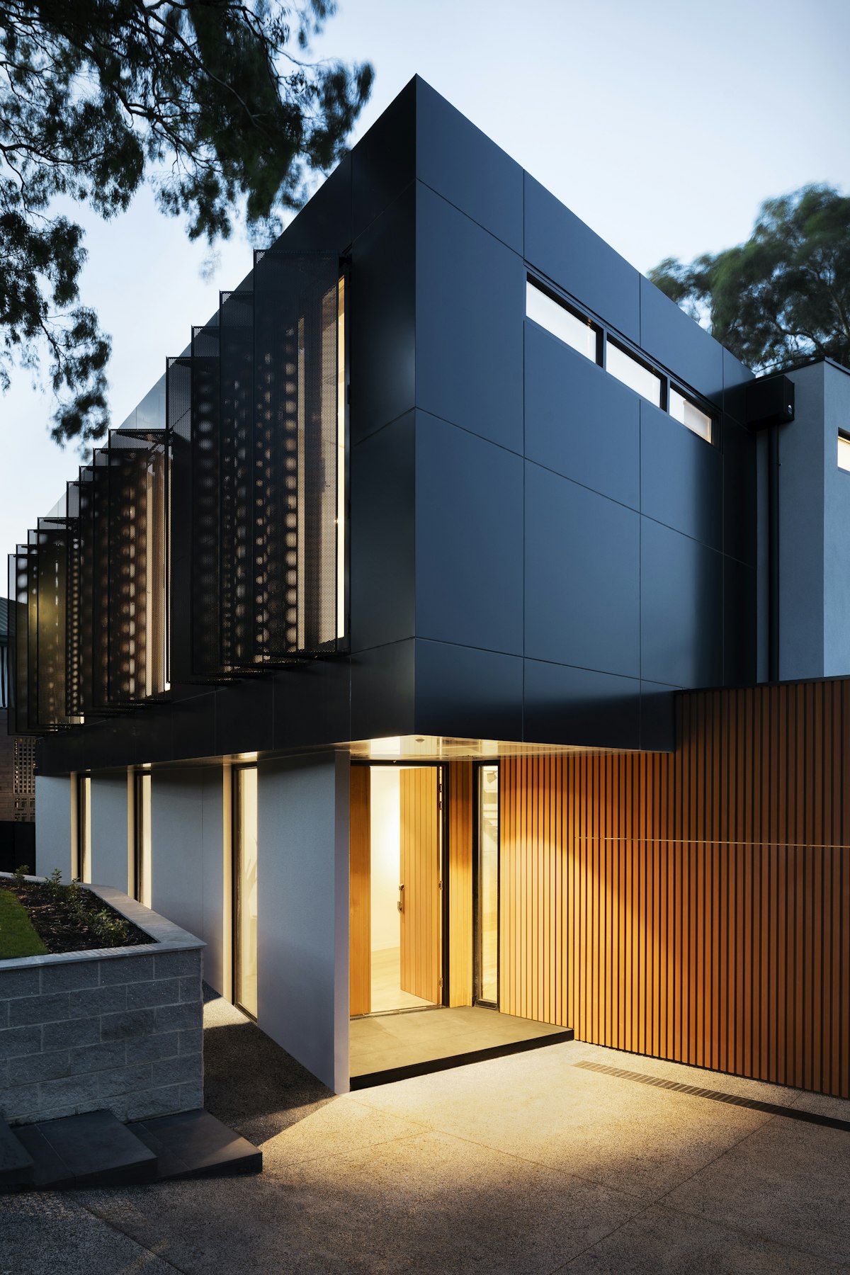
Lighter cladding tones like Silver Grey reflect heat and suit coastal settings. Darker tones like Charcoal Ash and Smoked Walnut create striking contrast against light render or landscaping. Warm mid-tones integrate naturally with timber and stone elements.
The Feature Wall
Not every wall needs cladding. A single feature wall or entry portal can create impact without overwhelming the design. Use cladding strategically - entries, courtyard walls, and street-facing facades deliver the most visual return.
Material Confidence
WPC cladding offers the look of timber without the maintenance of painted or oiled timber weatherboards. UV-stable colours mean the facade looks composed for years, not months.